
1 system
a connected identity across physical and digital touchpoints
Case study · Brand identity & digital experience
We created a warm, sophisticated visual identity for Ortho Keep Smiling—bringing clean dental geometry, approachable colour and a clear digital experience into one trusted brand.
a connected identity across physical and digital touchpoints
custom brand assets created for a consistent rollout
increase in online booking rate after launch
reduction in front-office administrative time
Project overview
The dental category can often feel clinical, cold and anxiety-inducing. Ortho Keep Smiling needed a visual language that would build confidence before patients ever stepped into the clinic.
Develop a comprehensive identity that balances medical credibility with warmth, then carry that system into a simple digital experience designed for patients of different ages.
Replace apprehension with reassurance. Every brand element needed to make information easier to understand, appointments easier to book and the clinic easier to trust.
The challenge
Advanced treatment and medical infrastructure needed to feel authoritative without becoming intimidating.
The identity had to soften the category and help patients feel comfortable, informed and welcomed.
The digital journey needed to remain intuitive for multi-generational patients and families.
Our approach
Defined the emotional space between expertise and reassurance.
→Created the logo, palette, typography and graphic language.
→Translated the system across patient-facing touchpoints.
→Built a clear, friendly path from information to booking.
Visual identity
Soft colour, confident geometry and carefully structured typography create a brand that feels professional without losing its personality.


Results
The finished identity gave Ortho Keep Smiling a confident presence while the clearer digital experience helped turn patient interest into appointments more efficiently.
Increase in online booking rate during the first six months after launch.
Reduction in front-office time through a more streamlined booking workflow.
Custom elements created to keep the identity consistent across applications.
Next project
Continue to the next Minerva Visuals case study or explore the full selected-work archive.
Vytvorili a strihli sme energickú kampaň pre sociálne siete pre Bolt Taxi, postavenú na krátkych filmoch s reálnymi vodičmi, na podporu náboru vodičov v Bratislave.
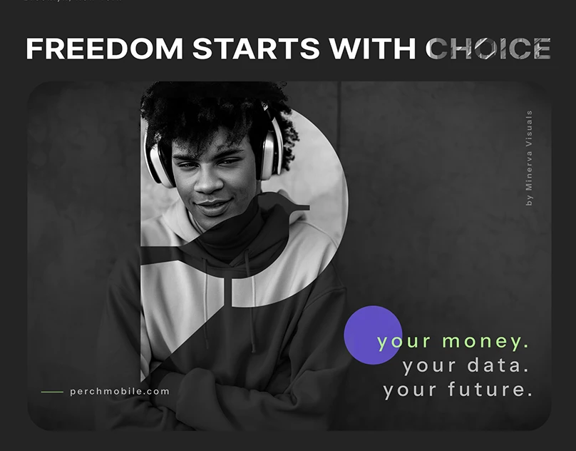
We developed a minimal, rebel-archetype visual identity for a disruptive New York-based mobile carrier that helps users build credit simply by paying their phone bills.

A modern, highly engaging multilingual platform showcasing 15 years of dedicated nature conservation, engineered to drive volunteers, donations, and global eco-awareness.