15 years
of field conservation translated into one coherent experience
Case study · Conservation platform UI/UX
Justice for Nature needed more than a digital archive. It needed a multilingual experience that could turn fifteen years of conservation work into clear stories, meaningful participation and measurable support.

of field conservation translated into one coherent experience
designed across programs, stories and participation journeys
supporting Czech, English and Spanish audiences
increase in social-media-to-website traffic
Project overview
The new platform had to represent the credibility of an established nonprofit while making complex programs understandable to supporters, volunteers, donors and international partners.
Minerva Visuals led the complete UI/UX design, organizing extensive field operations, scientific monitoring, education and participation into a responsive digital system. Web25 translated the design into the live multilingual platform.
Move visitors from awareness to action without flattening the organization’s real-world complexity: discover a project, understand the impact, volunteer, donate or stay connected.
The challenge
Projects, reports, field operations, scientific monitoring and education needed hierarchy without losing depth.
Donation, volunteering, newsletter and project-support journeys required different context but a consistent interaction language.
The design needed to remain clear, responsive and structurally stable across Czech, English and Spanish content.
Our approach
Mapped programs, reports, audiences and participation goals.
→Connected awareness, project discovery and action pathways.
→Built responsive patterns for stories, archives and CTAs.
→Aligned layouts, states and responsive behavior with Web25.
Visual direction
High-impact conservation imagery carries emotion while disciplined spacing, typography and modular content patterns maintain trust and usability.
UI/UX capabilities
Each part of the platform has a distinct job, but all of them share one visual and interaction language.
Narrative UX
Project pages combine strong imagery, concise context and progressively disclosed detail so visitors can understand why the work matters before choosing how to participate.
Information architecture
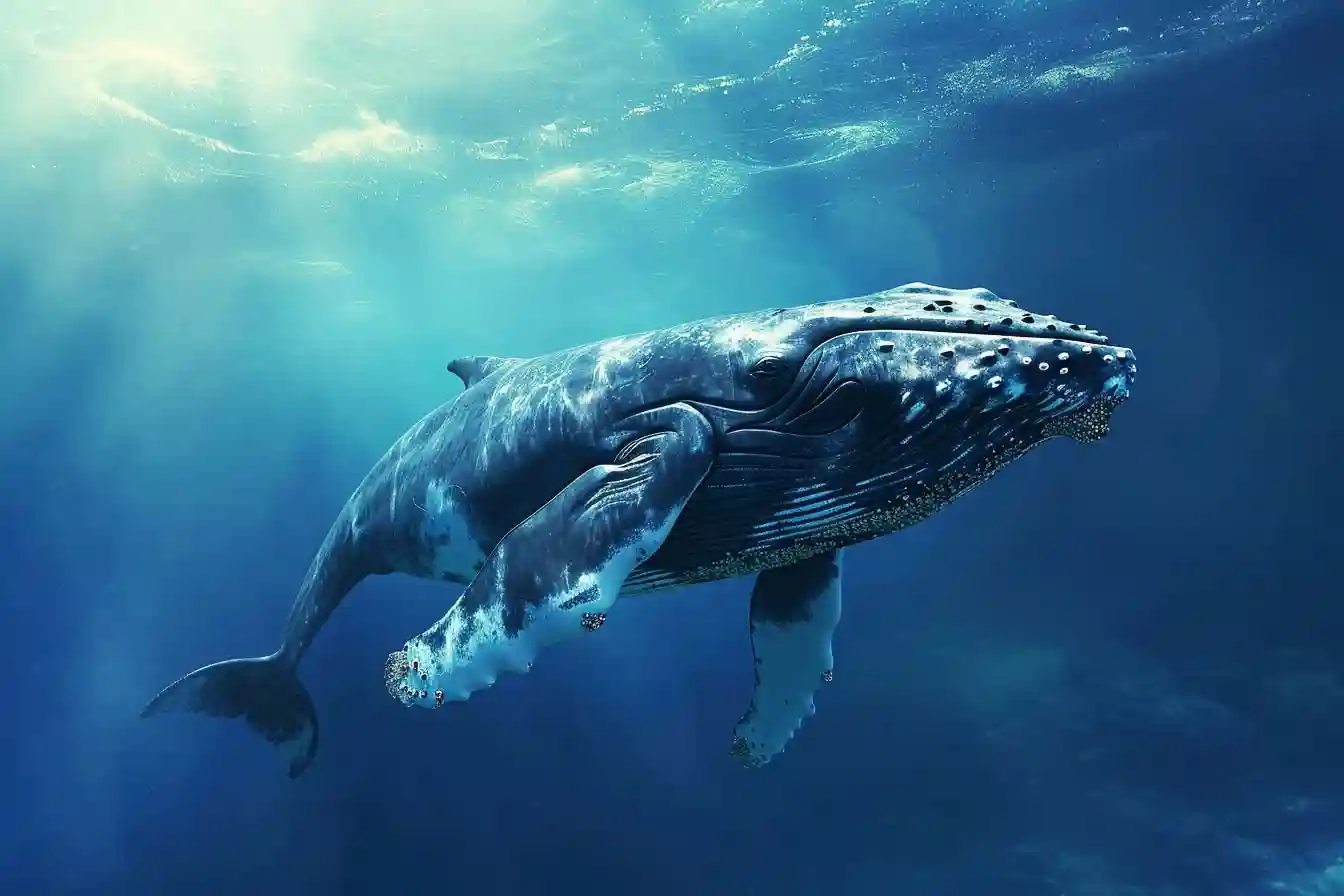
Projects span rainforest protection, ocean monitoring, ranger support, environmental-crime prevention and education. A reusable card and taxonomy system keeps discovery manageable.
Conversion design
Donation, volunteering and newsletter entry points use direct language and repeat at contextually relevant moments instead of competing for attention everywhere.
Global reach
The visual system accommodates changes in text length, navigation labels and editorial rhythm while keeping the same recognizable experience across regions.
Project film
Impact and results
The new experience gave campaign audiences a clearer landing point for continued exploration.
Focused participation journeys made opportunities easier to discover and understand.
Newsletter entry points and clearer messaging strengthened ongoing audience connection.
A structured content system helped the internal team manage information more efficiently.
“Working with the team was a fantastic experience. They truly captured our vision and translated it into a beautiful, functional website that now serves as the heart of our conservation efforts.”
Milan JeglíkPresident, Justice for Nature
Collaboration
Led information architecture, visual direction, responsive interface design and conversion-focused experience patterns.
Implemented the interface, multilingual infrastructure and production website in close collaboration with the design team.
Explore the outcome
Visit the live platform to explore its projects, field operations and ways to support wild nature.
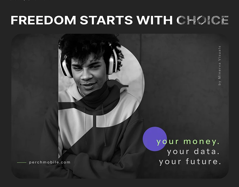
Perch Mobile needed more than a new look. It needed a connected experience that could move from brand expression to plan discovery, checkout and customer conversion without losing clarity or personality.
We developed a sophisticated visual identity for a modern orthodontic clinic, blending clean dental geometry with a warm, welcoming color palette to build patient trust.
We produced and edited a high-energy social campaign for Bolt Taxi, using character-led commercial films to support driver recruitment across Bratislava.