
Explain a new category
Connect mobile service and credit building in a way that feels simple, credible and immediately valuable.
Perch Mobile needed more than a new look. It needed a connected experience that could move from brand expression to plan discovery, checkout and customer conversion without losing clarity or personality.
Minerva Visuals created Perch Mobile’s complete visual identity, then translated it into a scalable digital language for acquisition, education, conversion and checkout.
The work began at the identity level: logo, color, typography, imagery and art direction. Those foundations became the reference point for every digital decision, from a marketing hero and campaign card to a form field, plan selector, progress indicator and checkout confirmation state.
Perch combines affordable mobile service with tools that help customers build credit history. The interface therefore had to feel optimistic and empowering while remaining trustworthy, understandable and friction-light at moments involving plans, billing and personal information.
Perch needed a distinctive youth-focused brand, but its digital experience also had to explain an unfamiliar value proposition, guide plan selection and earn confidence during checkout.
Connect mobile service and credit building in a way that feels simple, credible and immediately valuable.
Keep campaign pages, plan discovery, onboarding and checkout visually related without forcing every page into the same layout.
Use a high-energy visual identity without overwhelming pricing, forms, selections, progress or payment decisions.
Adapt dense plan and checkout information for mobile while keeping hierarchy, status and next actions visible.
Give development a reliable reference for layout, interaction states and revisions throughout delivery.
Create repeatable visual and interface patterns that could support new pages and customer flows without starting over.
The system was built as a connected sequence. Brand decisions established the language, product patterns made it usable, complete journeys tested it, and collaboration carried it into the live experience.
Build the mark, palette, typography, image treatment and tone around freedom, progress and confident choice.
Turn brand foundations into navigation, buttons, cards, fields, selectors, progress and feedback states.
Apply the system across marketing, internship, plan recommendation, checkout and responsive layouts.
Use Figma, email and Zoom to resolve questions, communicate revisions and support implementation.
The Perch identity combines a recognizable bird and letterform mark with high-contrast monochrome imagery, energetic purple and an optimistic lime accent.


Explore how the system moved between expressive campaign storytelling and structured product decisions.
A multi-step questionnaire reduces the effort of comparing telecom plans by turning personal usage into a guided recommendation.
The checkout balances billing and device information with a persistent plan summary, helping customers understand both what they are entering and what they are buying.
The expressive side of the system uses the same foundations in a more editorial way, pairing strong typography, image-led storytelling, proof points and an integrated application form.
Additional page concepts show how the same identity and UI foundations can support longer-form company storytelling while remaining connected to the wider Perch experience.
The live website carries the system into a public customer journey that explains the product, compares the offer, presents pricing and moves visitors toward selecting a plan.

Minerva Visuals worked directly with Perch developer Jim Henderson throughout delivery, keeping questions and refinements connected to the design source.
Layouts, responsive compositions, interaction flows, field groupings and revisions stayed visible in one shared design environment, reducing ambiguity as the experience evolved.
Email and Zoom meetings were used during delivery to discuss requirements, respond to questions and align design intent with development constraints and revisions.
The result is not a collection of isolated screens. It is a connected identity and interface language that can flex between storytelling, plan decisions, forms and purchase flows.
The same visual and interaction principles connect marketing, plan selection and checkout.
Figma, comments and direct meetings gave implementation a maintained source for decisions and revisions.
Cards, fields, buttons, selectors, progress and feedback patterns can be extended into future journeys.
Perch’s confidence and optimism appear not only in visuals, but also in hierarchy, guidance and interaction.
A concise view of the role, scope and delivery.
Minerva Visuals created the complete visual identity and designed the UI/UX for the main website, checkout, plan recommendation wizard, internship campaign and responsive layouts.
The core palette, typography, image direction and brand personality were translated into repeatable navigation, button, card, form, selector, progress and feedback patterns, then applied across complete customer journeys.
Minerva Visuals collaborated directly with Perch developer Jim Henderson through Figma comments, email and Zoom meetings throughout delivery. Figma remained the shared design reference for layouts, responsive behavior, flows and revisions.
The full Perch Mobile identity case study is available on Behance, while the implemented customer experience can be viewed at perchmobile.app.
We connect identity, interface design and implementation thinking so every customer touchpoint feels like part of the same experience.


A modern, highly engaging multilingual platform showcasing 15 years of dedicated nature conservation, engineered to drive volunteers, donations, and global eco-awareness.
We produced and edited a high-energy social campaign for Bolt Taxi, using character-led commercial films to support driver recruitment across Bratislava.
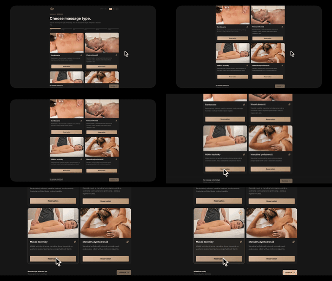
A full-stack case study showing how a custom booking engine replaced the limitations of generic third-party booking tools.