Elements of 2D Design

2D design (two-dimensional design) is the arrangement of visual elements such as line, shape, color, value, texture and space on a flat surface that has only width and height. Logos, posters, packaging, websites, app screens and illustrations are all 2D design.
The 2D design is the process of selecting the visual elements and understanding foundational principles of art and design. A 2D design has only 2 dimensions: length and width.
2D Design is the core of graphic design and visual communication. It is about composing essential elements and principles to form visually pleasing designs.
Artists use these principles to express themselves, while graphic designers use them to provide visual communication.
Concepts of 2D design are used across many art disciplines:
- Drawing
- Painting
- Illustration
- Photography
- Video
- Graphic design
Elements of 2D Design
Visual communication serves as a means to communicate ideas, information, and emotions to a viewer. 2D design is widely used in digital art.
The goal of a graphic designer is to communicate as clearly as possible. In some cases, this may mean not using too many visual elements.
And what are the visual elements of 2D design?
All designs are composed of these principal elements:
- Line
- Color
- Value
- Shape
- Texture
- Space
Line
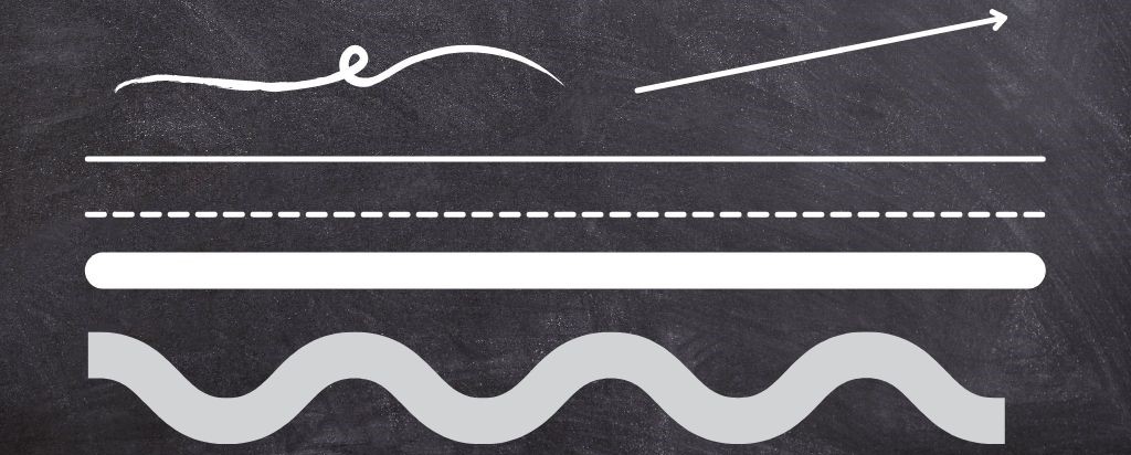
The line is a powerful element that can form a dominant emotion in the observer. Lines can be straight or curved, thin or thick, continuous or broken, vertical/diagonal/horizontal.
Lines define edges and space, create a sense of weight and volume, etc.
Color
Color stimulates both mental and physical responses in the viewer. There are some responses associated with warm colors (red, yellow, and orange) and cool colors (blue, purple, and green). In general, warm colors are associated with active and exciting emotions while cool colors usually create passive and calming responses.
Color has 3 different properties: hue, saturation (chroma), and value (lightness or darkness).
Hue describes the wavelength of the color. There are colors classed as “pure hues”: red, orange, yellow, green, blue, and violet.
When you add saturation and value to a pure hue, you will create new tints, tones, and shades of a color.

Value
Value is how light or dark an area is, from pure white to pure black. It works with or without color: a black-and-white photo is built entirely from value.
Strong value contrast pulls the eye and makes text readable. Close values feel calm and soft. A quick test is to turn your design grayscale: if the important parts still stand out, the values are working.
Shape
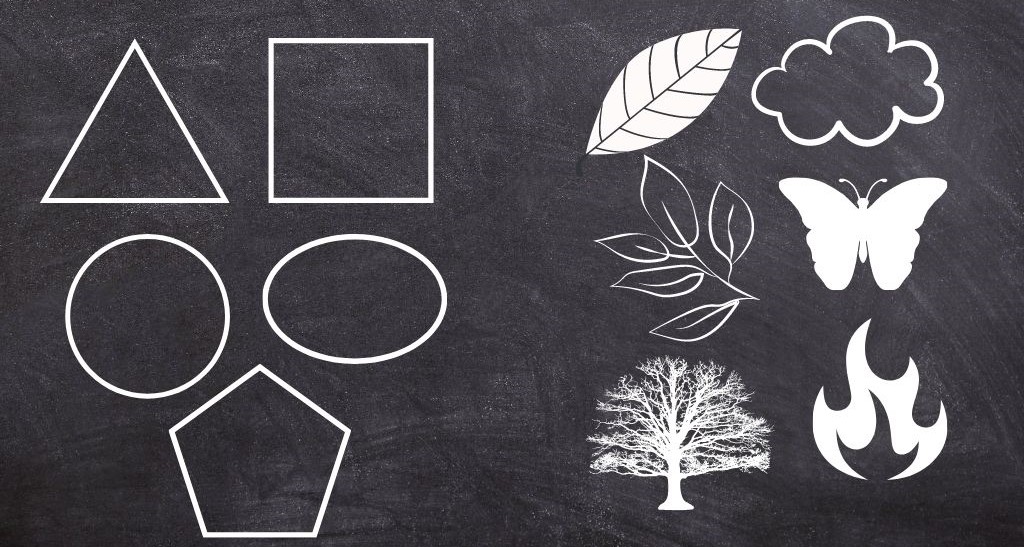
A shape is enclosed two-dimensional space. The basic profile of a shape can consist of straight lines, curved lines, or a combination of both.
There are 2 general categories for shapes: Geometric and Free-Form shapes.
Geometric shapes are regular and can be described in mathematical terms. Some of the examples are triangles, squares, circles, ellipses, pentagons, etc.
Free-Form shapes are more difficult to define because they are irregular and uneven. Some examples of Free-Form shapes are clouds, butterflies, leaves, trees, rocks, fire…
Texture
Texture refers to the feeling or looks of the surface (how the surface feels or the way it is perceived to feel).
Tactile texture is a texture that you can feel by touch. Designers in 2D design use the second type: visual texture. Visual texture is made on a flat surface and it’s basically the illusion of tactile texture.
The texture of an object can feel or look rough, smooth, soft, hard, silky, shiny, pebbly, and so on.
Space
Space is the area around, above, below, or behind an object. In 2D design, space is about creating the illusion of a third dimension. For example, in a two-dimensional setting space can be created by shadows, sizes, overlapping, or color different from the background.
Example: You can use size to create the illusion of larger objects appearing closer and smaller seem to be more distant.
Empty space (also called negative space or white space) matters as much as the filled areas. It gives elements room to breathe and can even form its own shape, like the arrow hidden between the E and the x in the FedEx logo.
Principles of 2D Design
The principles of a good 2D design are guiding designers through a design process. The aim is to create effective and aesthetically pleasing outcomes.
These principles relate to the use of elements (line, color, value, shape, texture, and space). Elements are the ingredients; principles are how you combine them into a composition.
The principles of 2D design are:
Unity
Unity gives a design a sense of cohesiveness, so every part looks like it belongs to the same piece. Designers get there by reusing the same colors, fonts, shapes and spacing. A brand’s social posts feel unified when they share one color palette and one type style.
Balance
Balance is how visual weight is spread across the layout. It can be symmetrical (2 halves of the composition look identical, like a formal wedding invitation) or asymmetrical (a large image on one side offset by a block of text on the other). Dark, large and saturated elements weigh more than light, small and muted ones.
Rhythm and repetition
Repeating visual elements creates a rhythm that leads the eye through the design. Think of the evenly spaced product cards in an online shop, or a pattern on packaging. Breaking the rhythm once is a simple way to draw attention to one item.
Harmony
Harmony comes from combining similar or related elements: neighboring colors on the color wheel, rounded shapes with a rounded font, or photos with the same lighting. Unity is about the whole piece holding together; harmony is about individual elements getting along.
Emphasis
Emphasis decides what the viewer sees first. On a poster it is usually the headline or the main image; on a website it is the main call-to-action button. Size, color, contrast and position all create emphasis. If everything is emphasized, nothing is.
Contrast
Contrast places opposites side by side: light and dark, large and small, thick and thin, warm and cool. It creates interest and helps readability. White text on a pale yellow background fails because the contrast is too low.
Proportion
Proportion is the size of one element in relation to another. It shows hierarchy: the headline is bigger than the body text because it matters more. Proportion also makes a drawing believable, for example a person’s head and body at realistic sizes.
Examples of 2D Design
Most of the visual work you see every day is 2D design:
- Logos and brand identity: simple shapes, a limited color palette and a typeface that work at any size.
- Posters and flyers: a clear headline, one strong image and a balanced layout that reads from across the street.
- Packaging: labels and boxes that need to stand out on a shelf and explain the product in seconds.
- Websites and app screens (UI): layouts, buttons, icons and spacing that guide people to an action.
- Illustration: editorial images, children’s books and flat-style graphics.
- Infographics: data turned into charts, icons and short text.
- 2D animation: flat graphics that move, such as explainer videos and animated logos.
2D concept design
In games, film and animation, 2D concept design means flat sketches and paintings that define how characters, props and environments will look before anyone builds them. The same elements and principles apply: silhouette (shape), color mood and value contrast decide whether a character reads well at a glance.
2D Design vs 2D Art vs 3D Design
The terms overlap, but they are not the same thing:
| 2D design | 2D art | 3D design | |
|---|---|---|---|
| Dimensions | Width and height | Width and height | Width, height and depth |
| Main goal | Communicate a message or solve a problem | Personal expression | Build objects, scenes or products in space |
| Examples | Logo, poster, website, packaging label | Painting, drawing, digital illustration | Product models, 3D animation, sculpture |
| Typical tools | Illustrator, Figma, InDesign | Procreate, Photoshop, paint and paper | Blender, Cinema 4D, Maya |
2D design can still suggest depth with shadows, overlap and perspective, as described in the Space section. It stays 2D because the final result lives on a flat surface.
What Does a 2D Designer Do?
A 2D designer creates flat visuals for a specific purpose: a logo for a new brand, a set of social media graphics, a product label or the screens of an app. The job usually starts with a brief, moves through sketches and drafts, and ends with files prepared for print or screen.
Common tools:
- Adobe Illustrator or Affinity Designer for vector work such as logos and icons
- Adobe Photoshop for photo editing and raster graphics
- Figma for website and app interfaces
- Adobe InDesign for print layouts such as brochures and magazines
- Procreate for drawing and illustration on a tablet
FAQ
What is 2D design in simple words?
2D design is arranging lines, shapes, colors and text on a flat surface so that it looks good and communicates something. A logo, a poster and a website layout are all 2D design.
What are the 6 elements of 2D design?
Line, color, value, shape, texture and space. Some sources also list form, which in 2D design is the illusion of a three-dimensional object on a flat surface.
What are the principles of 2D design?
Unity, balance, rhythm and repetition, harmony, emphasis, contrast and proportion. They describe how to combine the elements into a composition that works.
What is the difference between elements and principles of design?
Elements are the building blocks you work with (line, shape, color). Principles are the rules for arranging them (balance, contrast, emphasis).
Is graphic design 2D design?
Mostly, yes. Logos, print, packaging graphics and web layouts are 2D. Graphic designers sometimes add 3D elements, such as product mockups or motion graphics, but the core of the discipline is 2D.
Which software is best for 2D design?
It depends on the job: Illustrator or Affinity Designer for logos and vector graphics, Figma for websites and apps, Photoshop for photo-based work and Procreate for drawing on a tablet.
Conclusion
Every 2D design, from a business card to a full website, is built from the same six elements and arranged with the same seven principles. When a design feels off, check the principles one by one: is there one clear point of emphasis, enough contrast to read it, and a balance that holds the layout together? Fixing one of these usually fixes the design.